Gion Festival
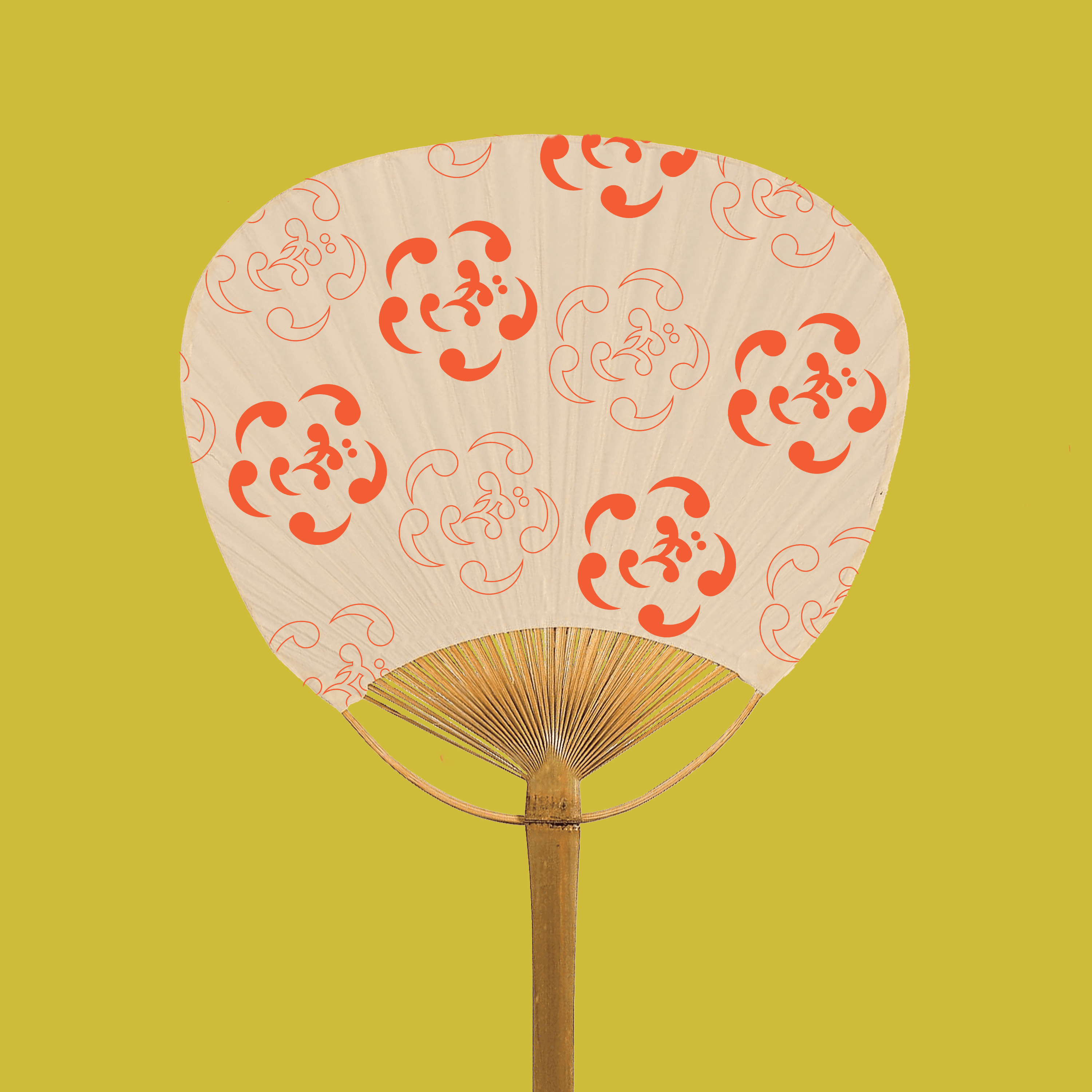
The 1150-year-old festival in Kyoto was rebranded through a new logo mark, poster, merchandising, and tickets. During July, various rituals and events are held to remove bad spirits that lead to epidemics and natural disasters. The objective of this brand identity was to pay respect to the rich history while exhibiting a modern take.
Client
Gion Festival
DELIVERABLES
Branding Research Pattern Design Typography
Year
2024
Role
Creative Direction


LOGO
Inspired by traditional motifs from Shinto iconography, these swirls are called magatama. In spirituality, they represent high status and nature. The five swirls or magatamas spiral around the Japanese letter ぎ (gi), representing the Gion Festival's first letter.


MERCHANDISE
Uchiwa, a traditional fan, and a happi, a ceremonial robe, were designed to promote festival spirit.